ISIpedia: the open climate-impacts encyclopedia
Generator
ISIpedia: the open climate-impacts encyclopedia provides the public with scientific knowledge about the effects of climate change. It offers the possibility to access simulated and collected data as well as future forecasts of the effects of climate change. The foundation from which ISIpedia builds is the scientific work done under Inter-Sectoral Impact Model Intercomparison Project (ISIMIP), a community of impact modellers studying the global and regional impacts of climate change on natural and human systems.
This project was launched during my time at CDLX in cooperation with the Potsdam Institute for Climate Impact Research (PIK). In 2019 the project was awarded the DDC Award in the field of interaction. In this case study, I want to focus on how the configurator for generating climate reports came to life and evolved throughout the project.
Functions
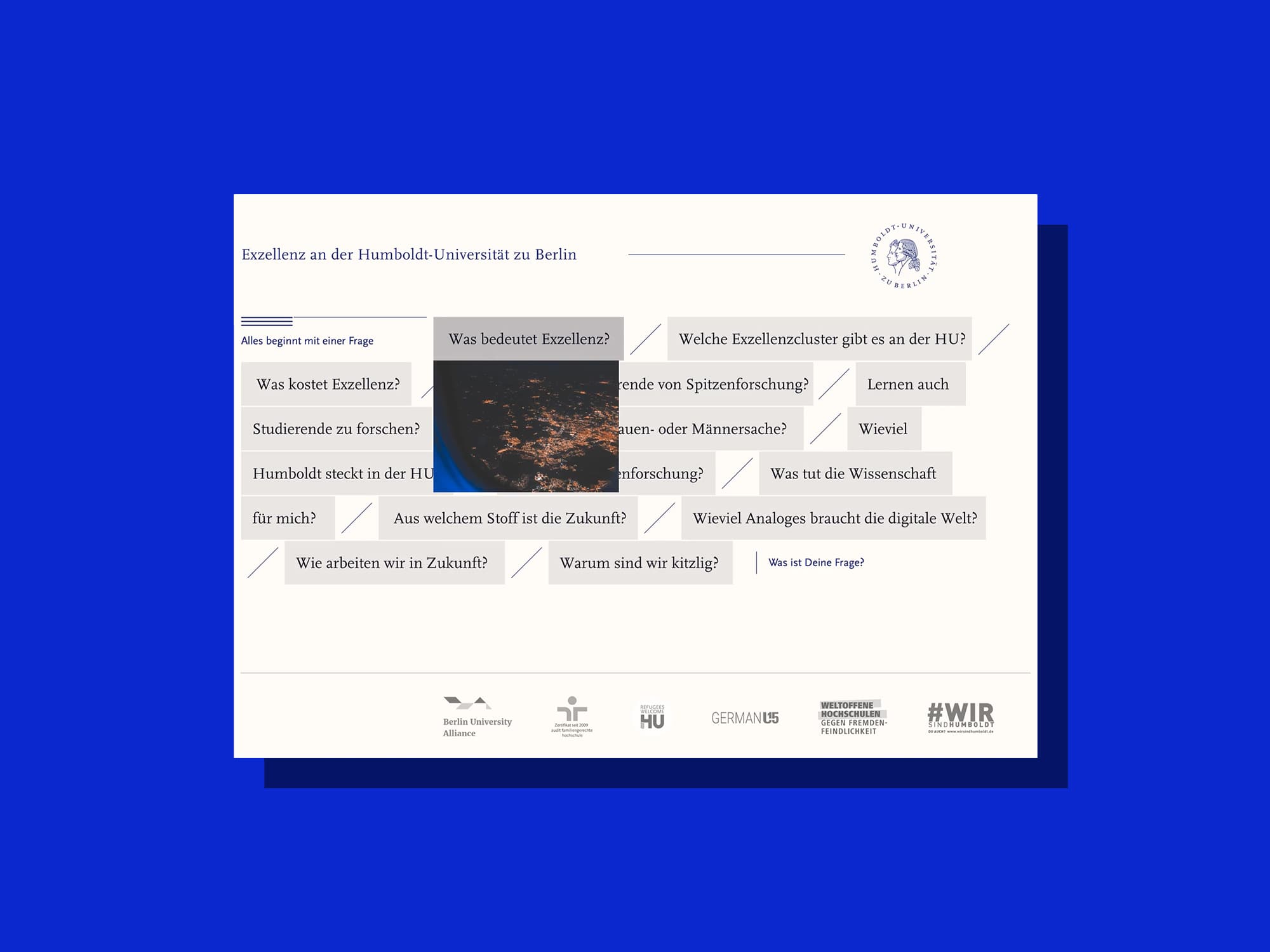
Let's begin by taking a look at the different parts of the configurator, what they do, and how they work together. The Configurator for creating reports is the heart of ISIpedia. By specifying the three parameters Type, Area and Topic, the users can quickly generate the required report and either download it as a PDF or modify it further through comparison of different climate models.
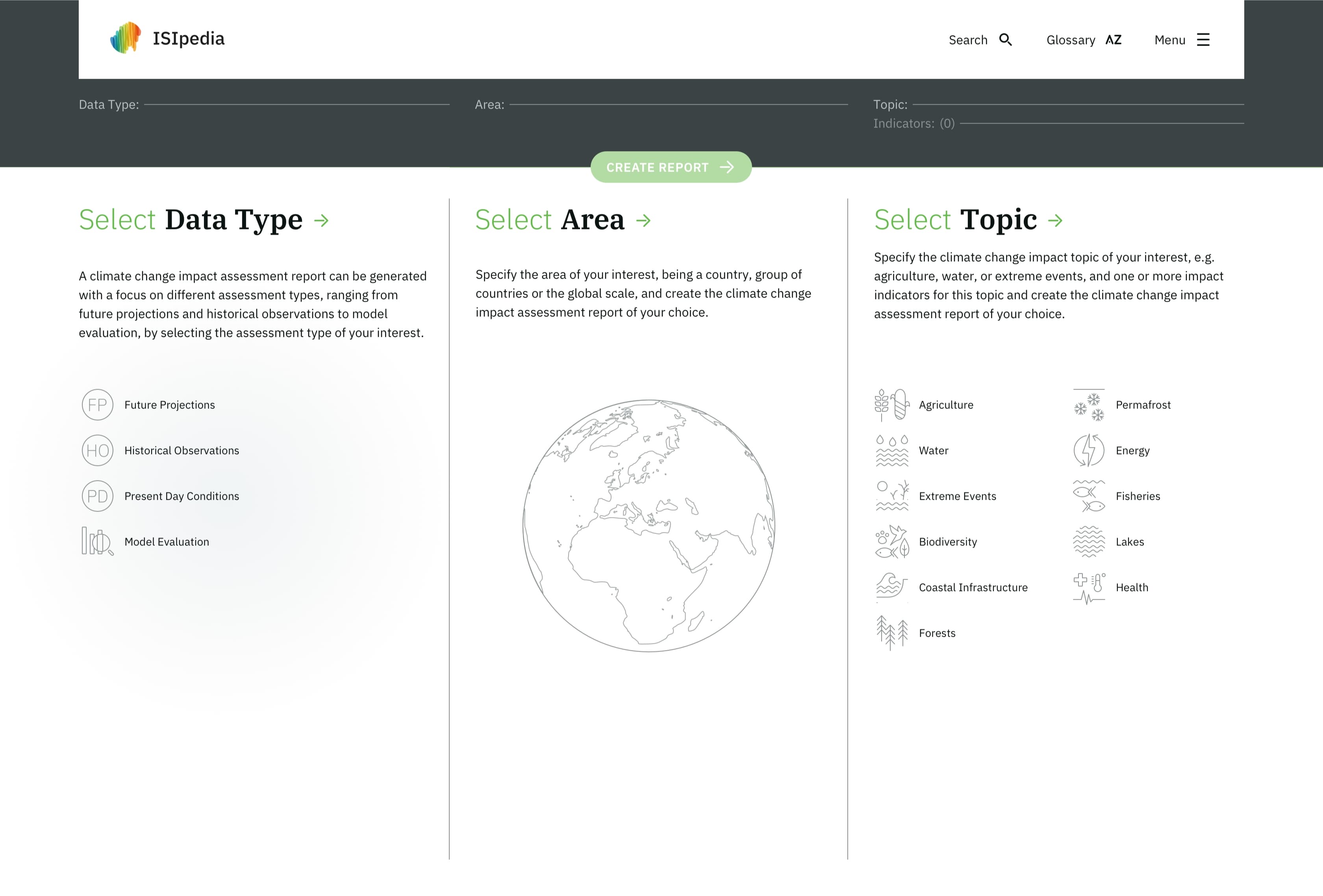
The entry point of the generator: Users see the different parameters they have to specify to generate a report.
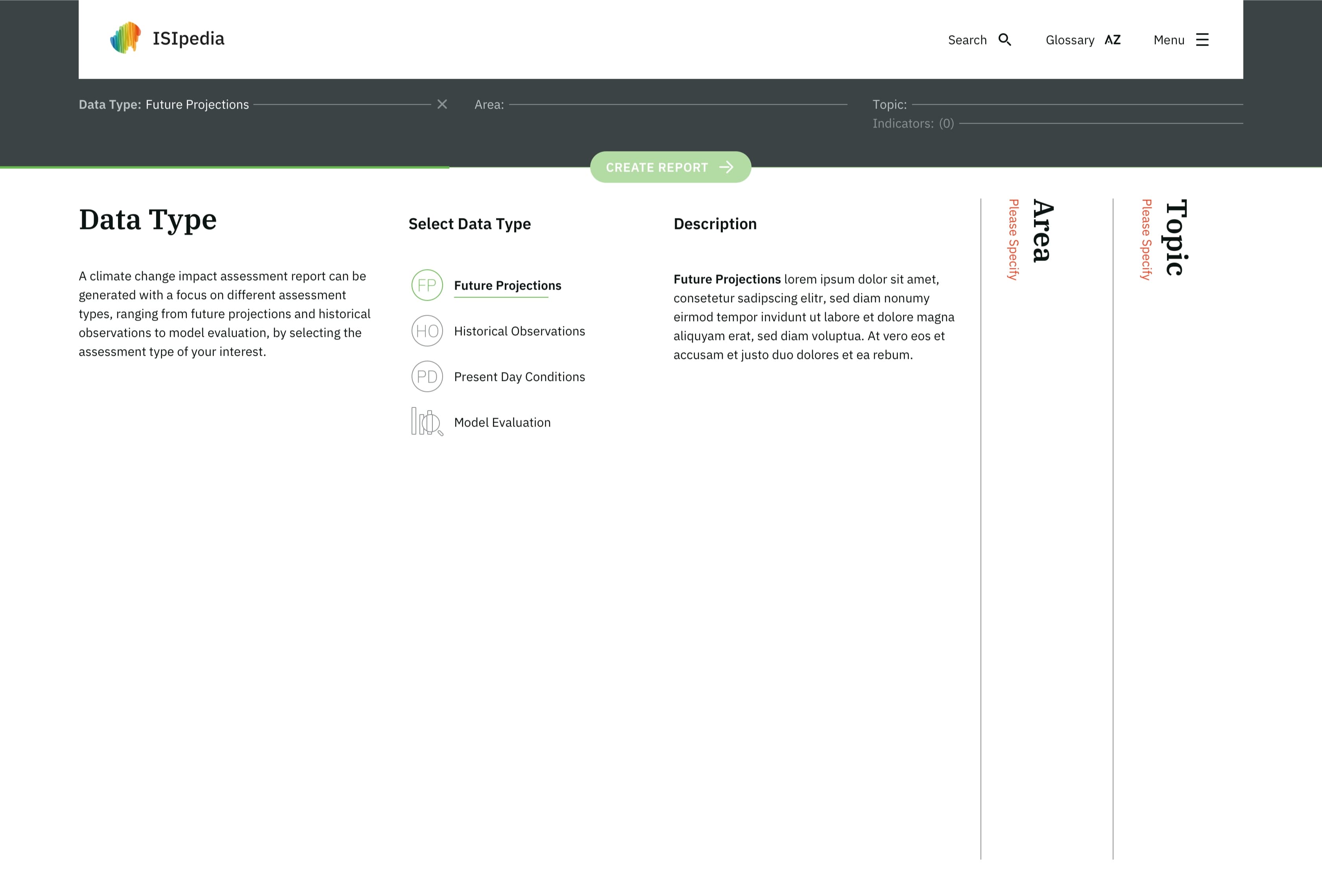
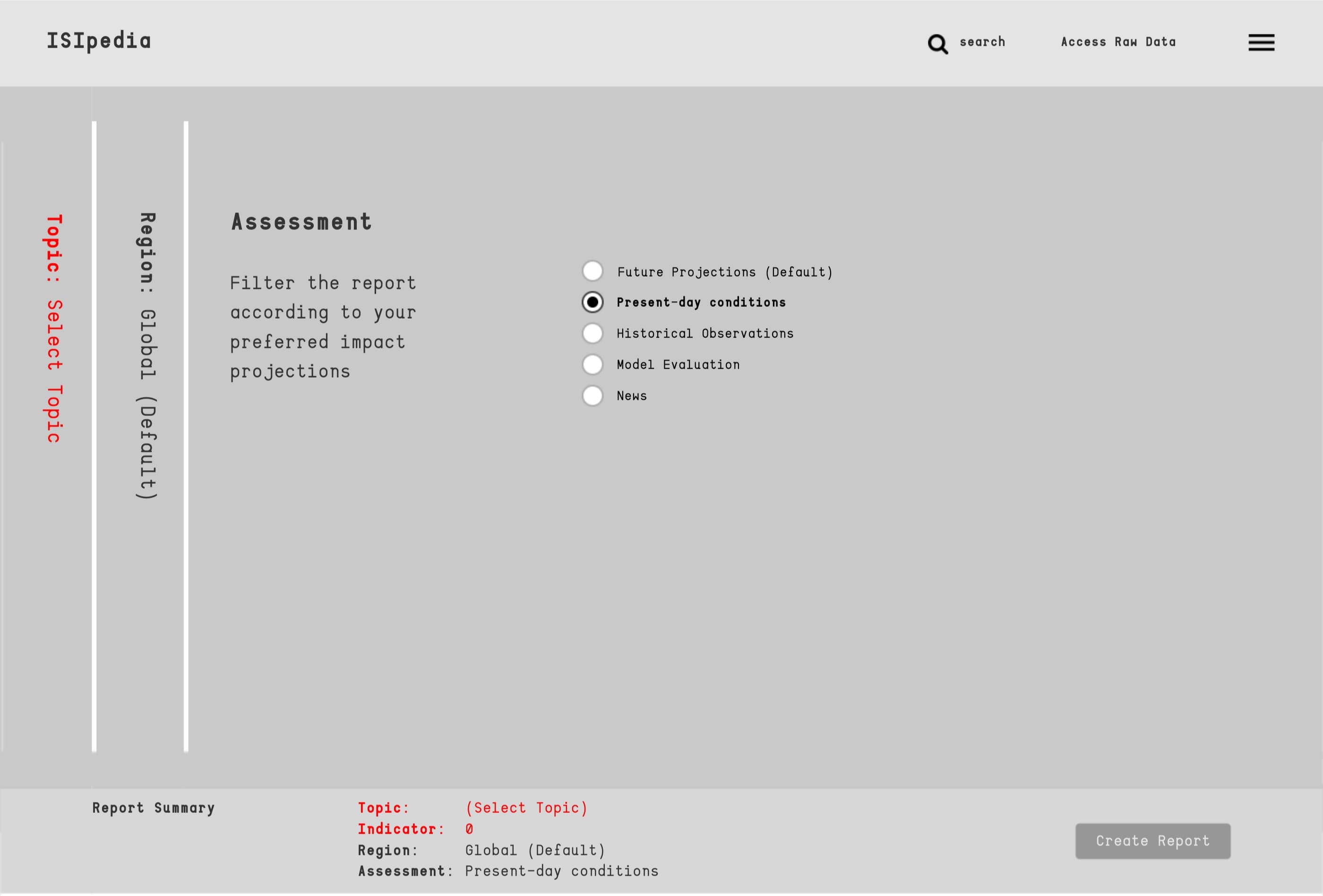
Data Type: For Data Type users can choose which model their report should be based on. Ranging from historical observations, present-day conditions or future projections.
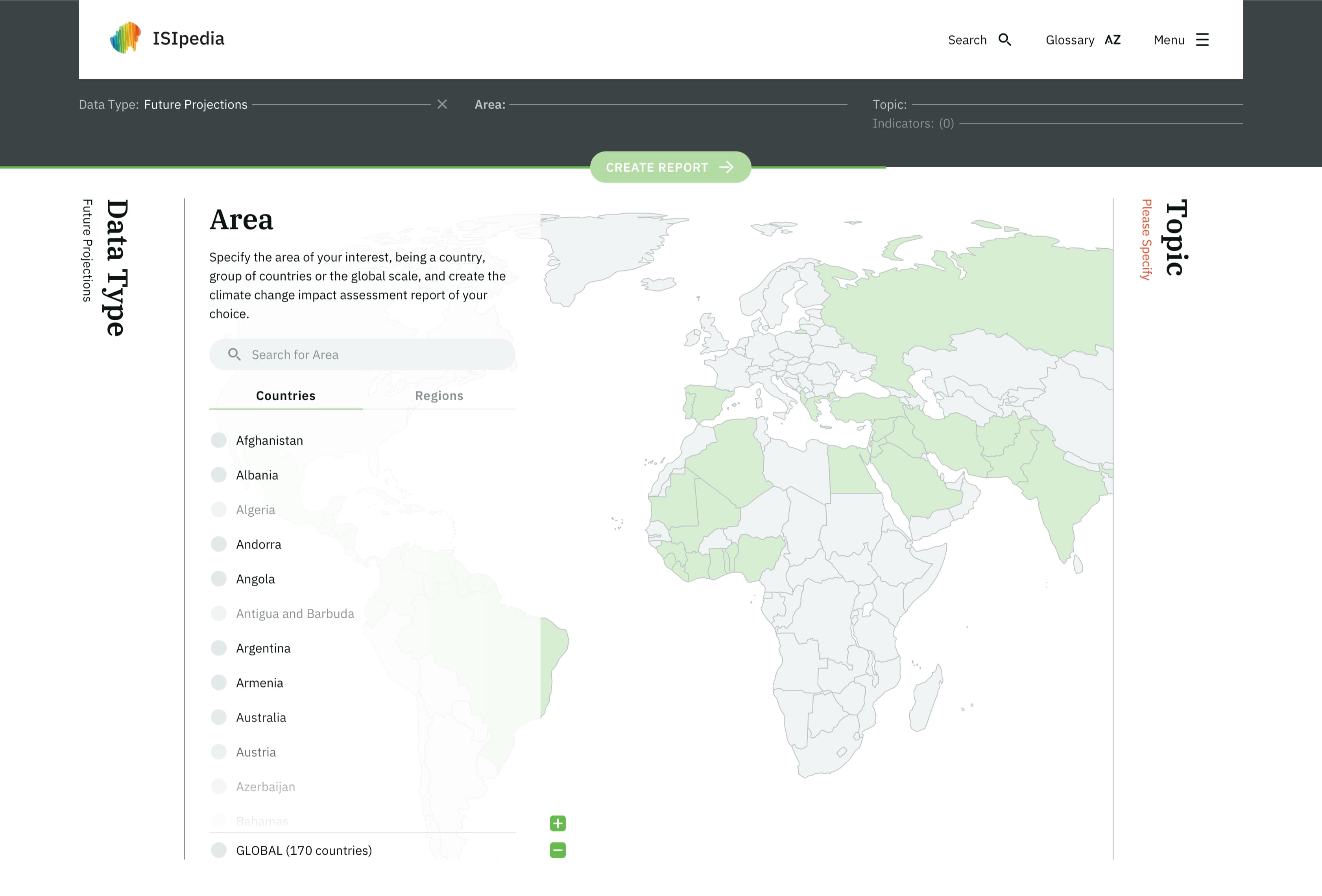
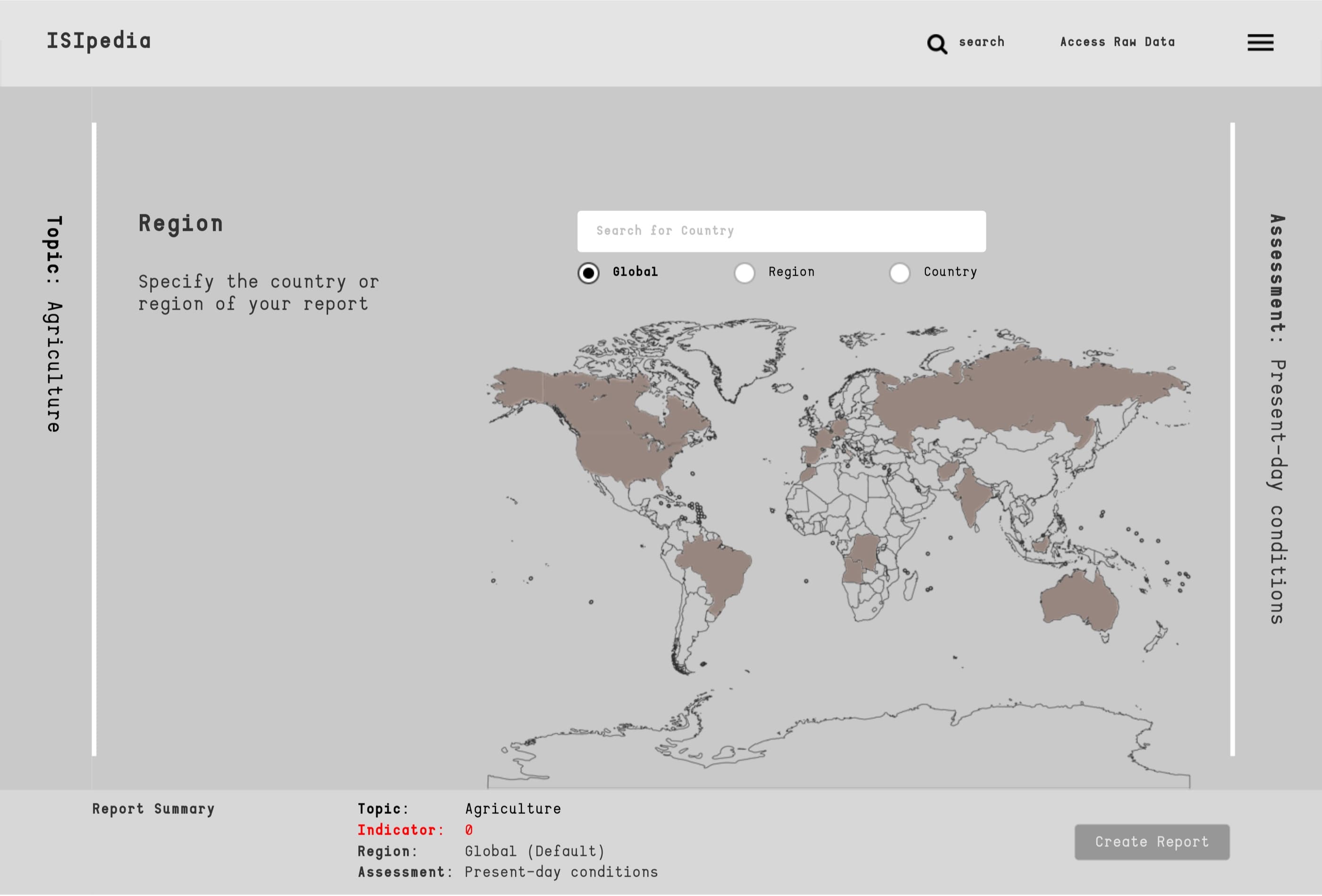
Area: Users are able to specify the area between a single country, a group of countries or the global scale. An interactive map shows which countries are available and offers a quick way to select a country.
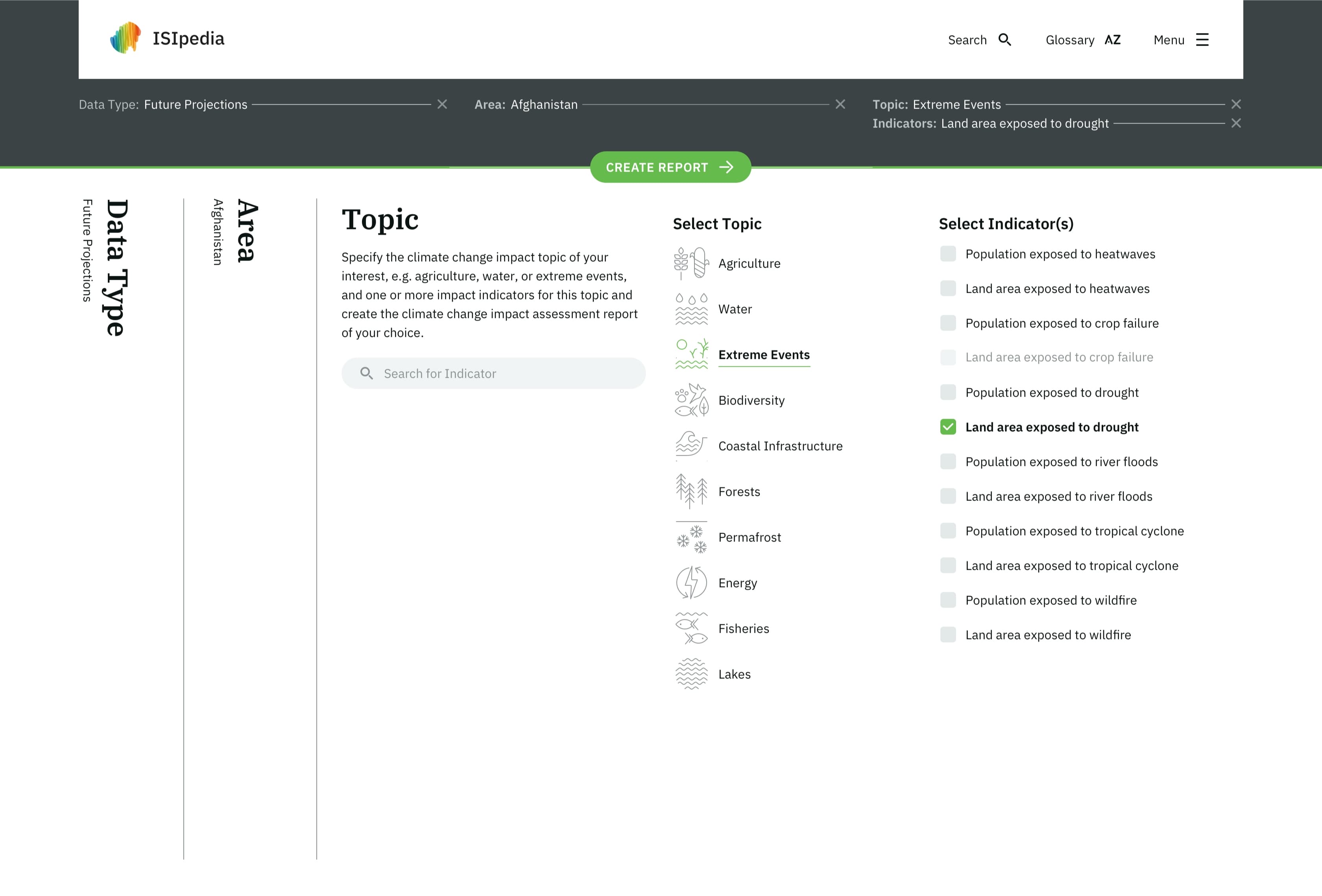
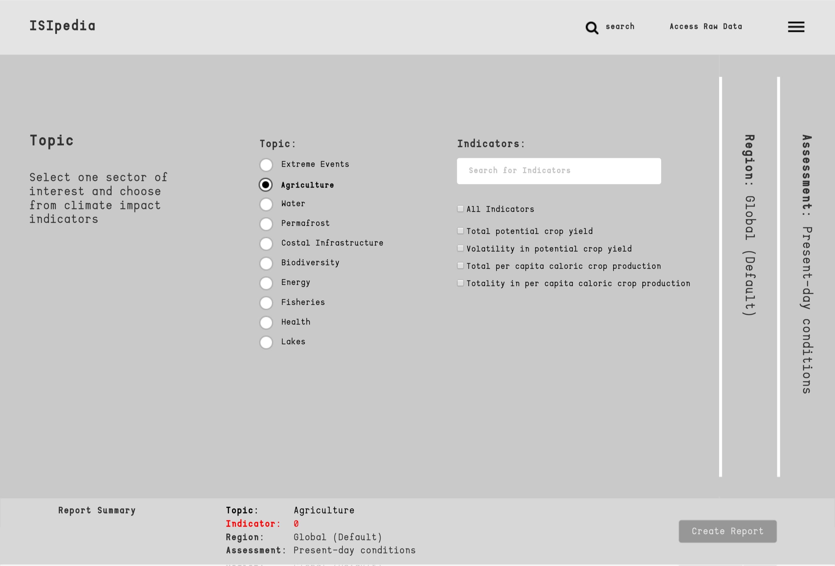
Topic: Within every big topic are several subtopics (called indicators), which can be freely selected and combined for the report.
First Drafts
The first drafts envisioned a rather linear path through the system, at the end of which a Summary Card
provides a final check of the entered values before a report can be generated.
However, since all input parameters are supposed to be hierarchically equal and users should be free to
choose their own entry point. This was soon changed. Furthermore, it cannot be guaranteed that all the
input data for the three parameters are available and thus compatible.
For example: Imagine you want to find out about 'historical observation' of 'drought' in 'Italy', but
the impact model has not been explored yet and is therefore not accessible. You just went through 2
steps to reach a dead end. Pretty frustrating, right?
Learnings
A guided process with dead-end frustrates users and complicates the process. The "Summary Card" as a separate item in the Configurator was also reassessed, as it mostly confuses users and only supports them if it's always in the viewport.
First conceptual wireframes for navigation.
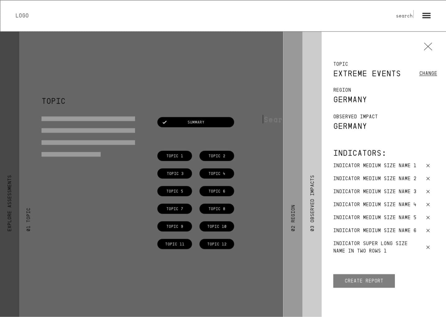
The accordion navigation was kept in our final design.
Testing of the Wireframe Prototype
After reworking the wireframes a functional prototype was crafted for our first user test. One advantage to test in this early stage is that the users won't be distracted by the design of the finished product and changes can be made more easily. The functional prototype was interactive and animated to feel more immersive and for users to better understand the transitions (e.g. the accordion menu). One part of the test users were supposed to create a report based on three given parameters, while the other part of the testers were told to explore the system freely. During testing, the users were asked to express their thoughts aloud. Audio and video were recorded for further analysis.
-> most users chose "topic" as the entry point
The test clearly showed the weaknesses and problems of the usability of our configurator. Although the navigation through the 3 steps was known and therefore unproblematic, almost all users complained about missing and too abstract information of what they were doing. This was particularly evident in the Data Type menu, (called Assessment at the time) and in the Summary Card on the bottom of the page, which was still too unobtrusive. Further problems were a default state of areas and data types. Some test users already generated a report after selecting only the topic. The default state prevented our users from fully understanding & experiencing the system so we convinced the client to remove it.
Comparison
With the feedback from our user tests, flaws and problems we wouldn't have seen were optimized.
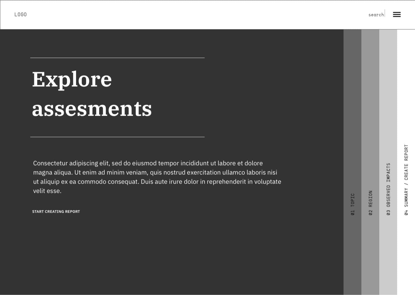
Entry Point (before): The old screens provided four different entry
points to the configurator. The first vision was to have the configurator as the landing page of
ISIpedia. This was changed due to the complex nature and functions of the topic itself.
Entry Point (now): In order to better understand what is hidden
behind the different points, they are clearly marked with icons and graphics. The Report Card is
located below the Main menu and covers the entire width of the screen.
Assessment (before): For many users, the subjects depicted were too
abstract. Except for our expert group, no one could really understand the selection..
Data Point (now): By hovering or clicking on one of the 4 selection
points, the users get a short explanation of what's behind these scientific terms. Data Type as a
name for this section proves far more accessible.
Region (before): The world map was perceived by nearly all of the
users as an interactive element to select a specific country. Selecting if you want to choose a
region, country or globally was not understood by everybody and too much in focus.
Area (now): The map gives a better insight into which countries
information is available. The active/inactive state is visually the same as the Generate Report
buttons. The selection between Areas and Global is now more clearly separated and shows how many
countries are really included in the Global option.
Team (CDLX)
Ivana Rubelj, Maciej Kodzis, Lisa Rudolf
Date
2019