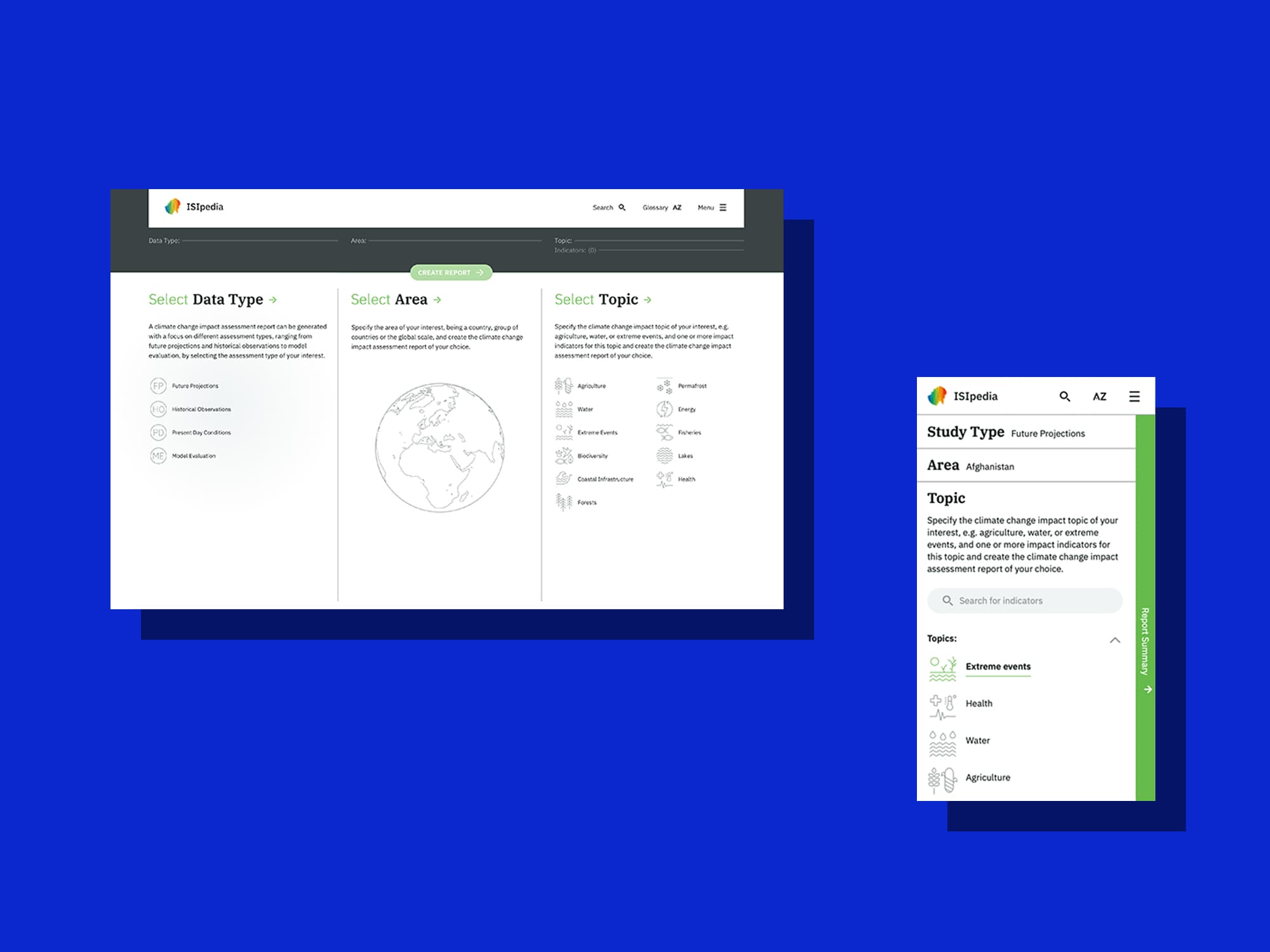
Sammlungen Online - Humboldt Forum
Website
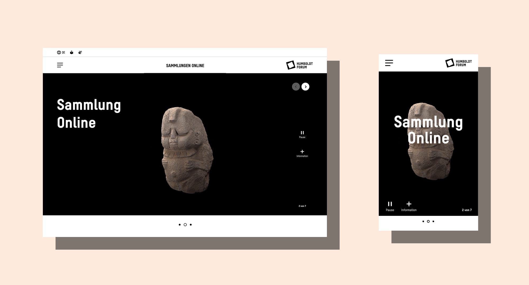
Hero section of the Sammlungen Online
Background
In celebration of the opening of the Humboldt Forum in Berlin, DAYONE won the pitch to design “Sammlungen Online”. A website dedicated displaying the museum's vast and various objects online. The goal was to create an intuitive and engaging website that allows users to access comprehensive object information and efficiently search and filter content.
Our Goals
- Easy accessible collections for everybody.
- navigation that invites the users to explore.
- Efficient search and filtering functions to quickly find specific works.
User Needs
To better understand user needs, we analyzed and interviewed various persons of our identified target groups:
- Researchers & Students: Required in-depth information and advanced filtering and options.
- Art Enthusiasts & Museum Visitors: Interested in objects of current exhibitions and interactive dislays.
- Cultural Institutions & Educators: Uses the digital collection as an educational resource.
- General Public: The exhibitions and their objects should also be accessible for people who are not able to visit the museum in person.
Competitive Analysis
Benchmarking against existing digital collection platforms like the Städel Museum or the Metropolitan Museum of Art provided insights and examples for improving information architecture and good user experience.
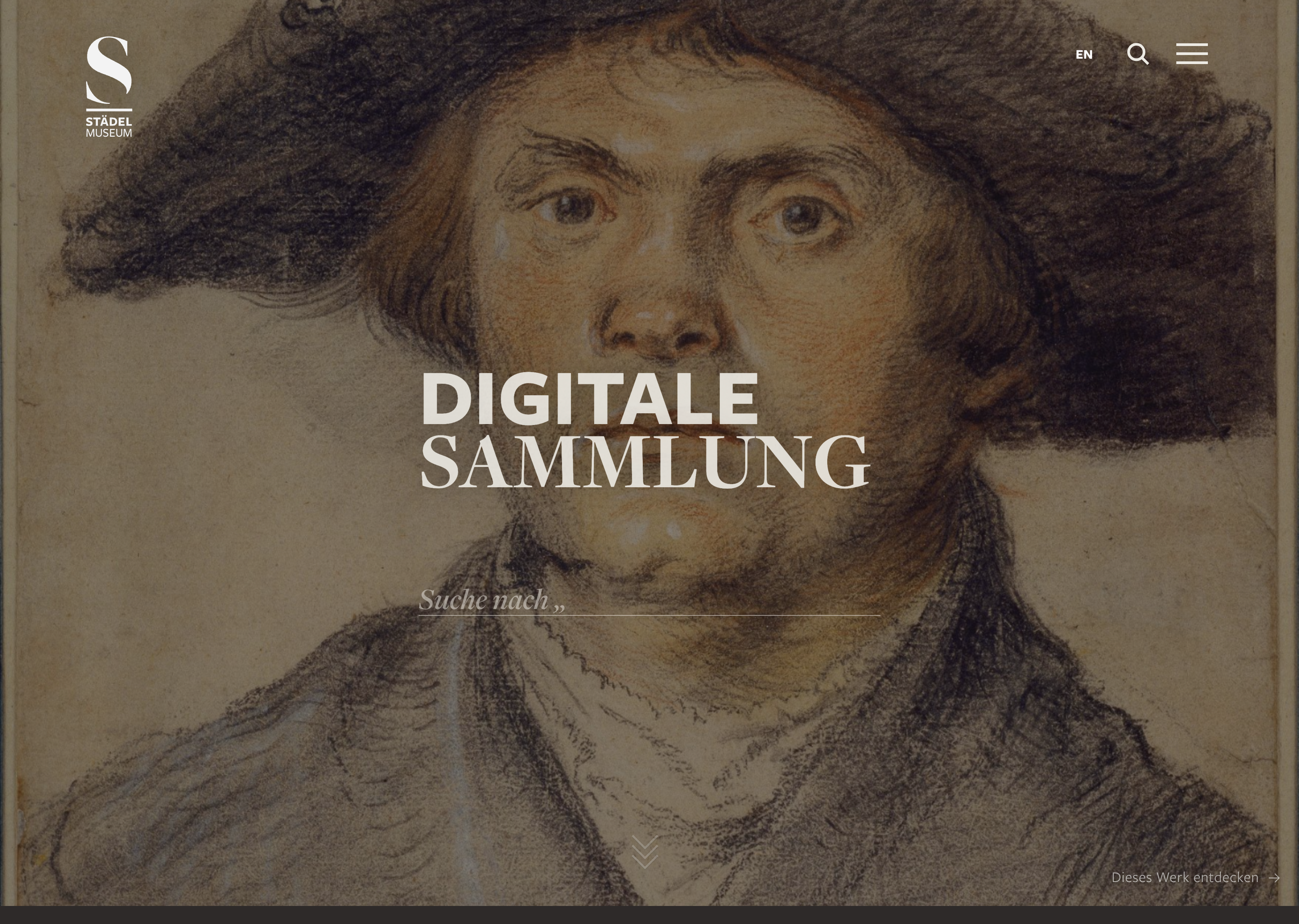
Städel Museum is great in inviting their users to explore their collection.
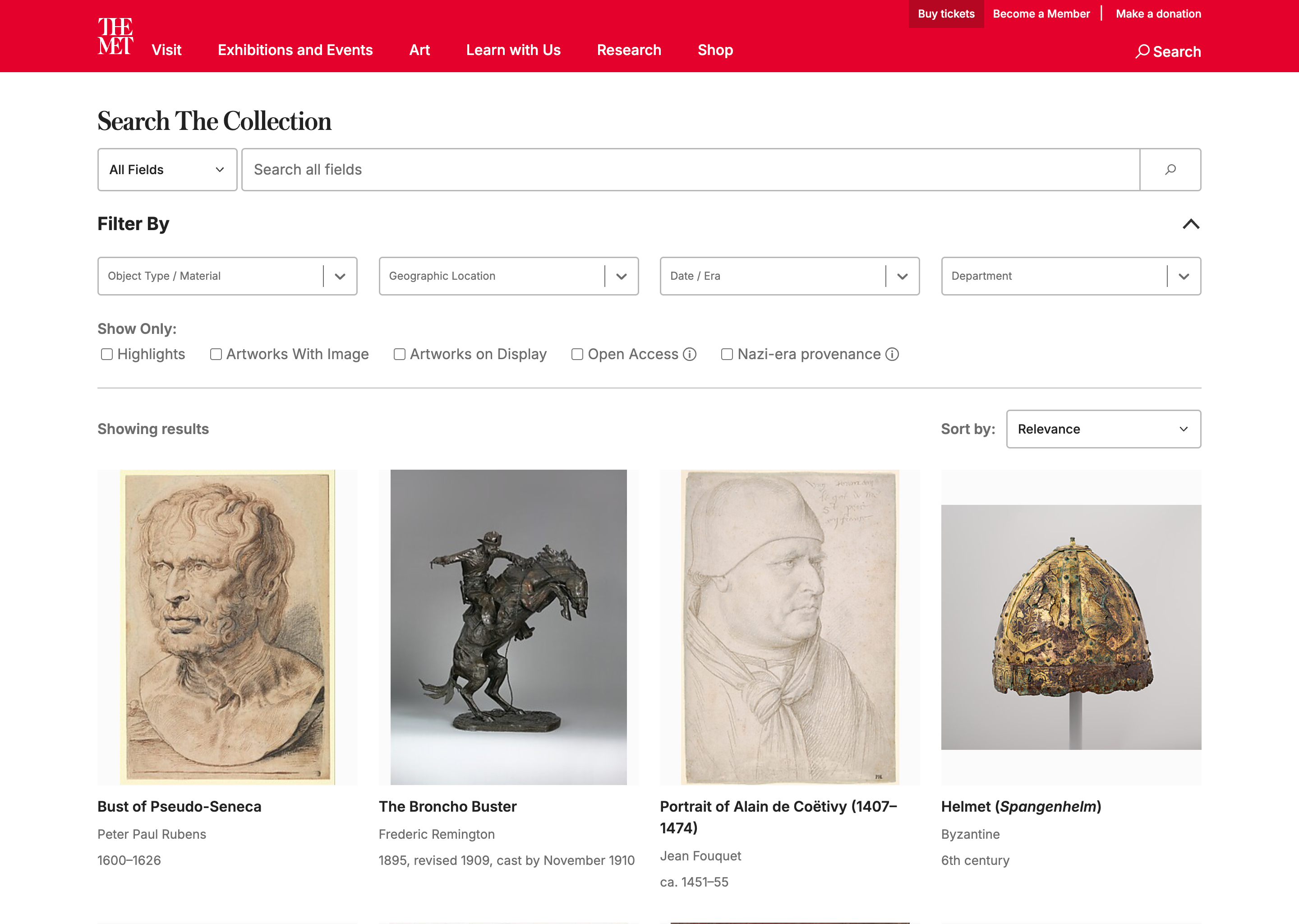
Like the Humboldt Forum, the MET collection has various types of objects. Their search and filtering options are vast but lack a good experience.
Final product
For our Go-Live we devloped a small scaled MVP with 3 different page types with recurring components. The home page, the object catalogue and the detail page.
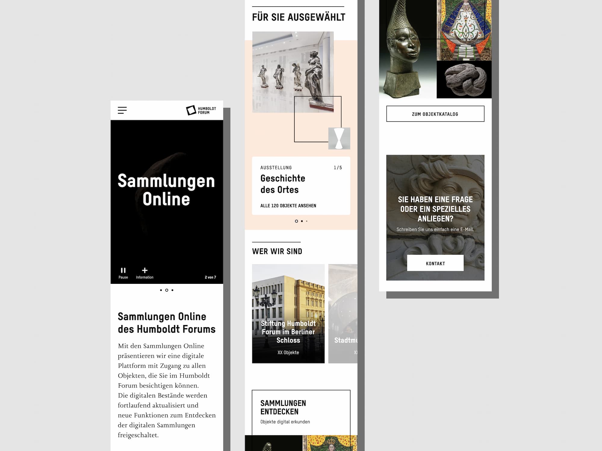
Full lenght mobile screenshot of the Sammlungen Online home page
Home page: serves as the main entry point for users, most of whom are likely arriving from the museum’s main website. Visitors are welcomed by a prominently featured 3D-scanned object in the hero section. From here, they can explore the object catalogue through three different pathways: one offers an unfiltered view of all available objects, another filters the selection based on current or permanent exhibitions, and the third allows users to browse objects based on their origin from the five culturally distinct museums in Berlin that contribute to the Humboldt Forum’s collection. These multiple entry points offer different perspectives on the collection and guide users directly to the individual object pages.
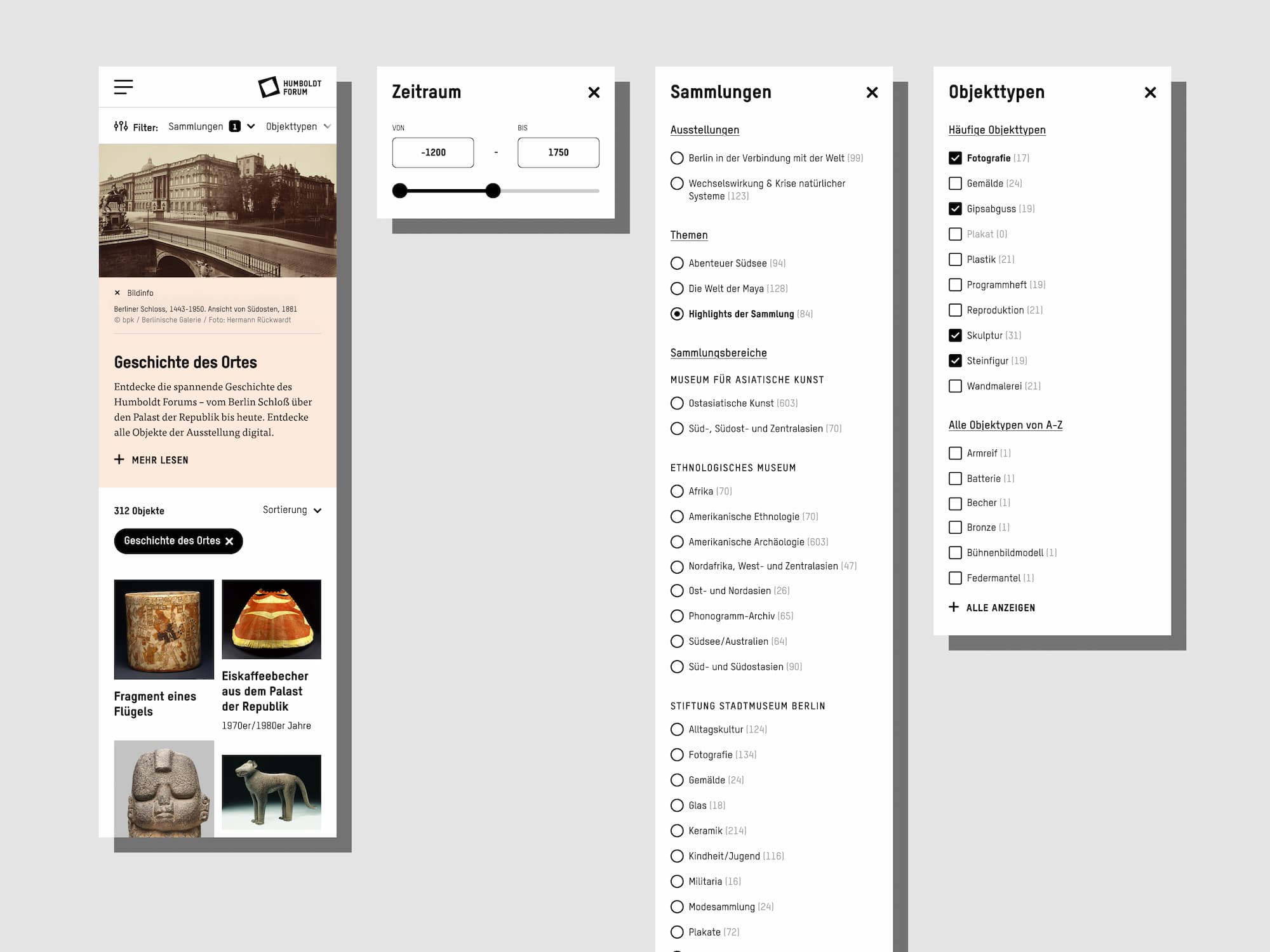
Exhibition filters give additional information about its topic
Object catalogue: Designed to support both focused research and exploratory browsing. While a full-text search was originally planned, it posed technical complexities that couldn’t be resolved in time for the initial launch. As a result, the MVP relies on a refined filtering system to help users navigate more than 6,000 diverse objects.
Users can filter by object type, time period, collection, and lending institution. To keep the extensive list of object types from becoming overwhelming, the most frequently used types are displayed separately at the top of the filter section. All filters can be combined freely, and the number of matching results is shown dynamically to prevent empty search results and guide users more effectively.
One major challenge was the inconsistent quality of metadata in the object database – many entries lacked key information such as time period or geographic origin. Another challenge was ensuring that the filtering system remained usable despite the large number of possible values, especially for object types and institutions.
When users choose to filter by exhibition, the catalogue displays additional context above the results. This includes a short introduction to the exhibition and a link for users who want to learn more about it before exploring the associated objects.
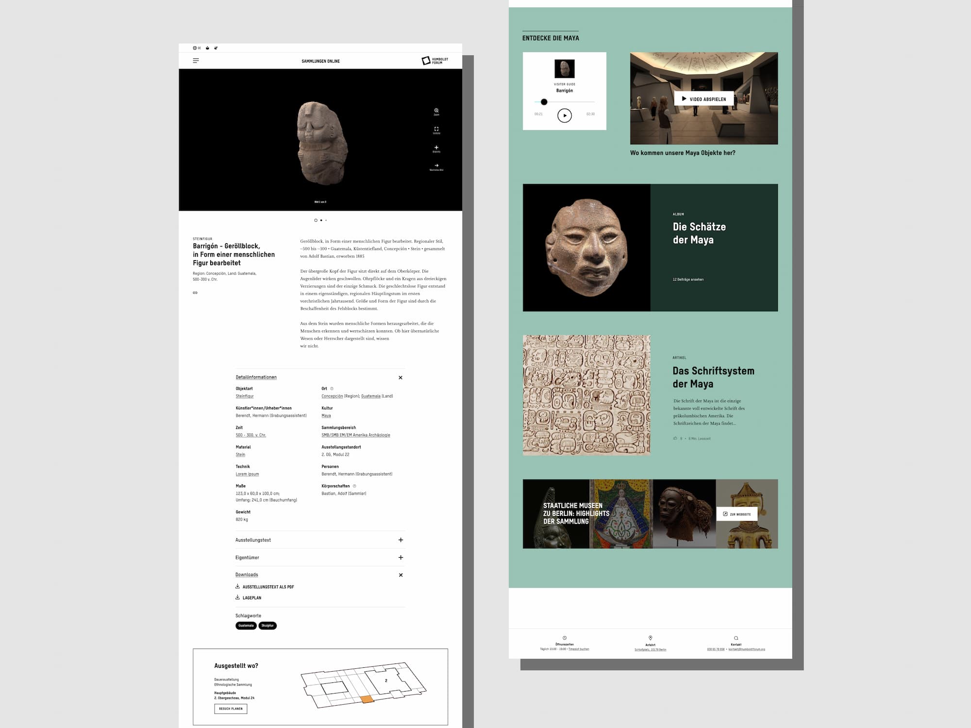
The detail page gives the user all the needed information and encourages users to see the bigger topic
Detail page: The object detail page presents all available information about a specific object in a clear and structured layout. Where possible, additional resources such as downloadable files are provided to support academic and research use. To maintain readability and avoid overwhelming users, the design follows a clean, minimalist approach with expandable sections that allow users to reveal more information as needed.
A key challenge was creating a layout that feels consistent and well-balanced across a wide range of content — from richly documented objects to those with minimal available data. The design adapts flexibly to both extremes without compromising clarity.
In addition to the core object data, an “Explore” section offers related content to provide further context. This area supports the museum’s educational mission and encourages users to delve deeper into the historical, cultural, or thematic background of the object.
Team (DAYONE)
Charlott Feibig, Jascha Babusek
Date
2020